A little creative thought for a Monday morning.
As per my usual routine of coffee and a quick update on the weekends events, my chrome address bar is pointed at the BBC homepage. As ever, it knows who I am and why I have returned. I can browse the results from the rugby while skipping across the latest Science and Nature discoveries, all because like an old friend it knows what I like to talk about… but whats this… “Explore the new BBC homepage”. Oh dear, I have seen this all before, just when you are happy they want to change it.

“Try out our new homepage design”
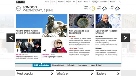
Navigating through to the new design, I am immediately hit with the volume of content, everything from CBB’ies to the latest Eastender catchup. The page is headed by a large horizontally scrolling wealth of content, you will find all that the BBC has to offer with a quick left to right. Different size images give different weight to different content articles. It definitely looks clean and crisp but where is all the content that I know and love? It tells me I am in London, and that the weather that I can already see outside my window is slightly overcast, but other than that I could be anyone.
In short it would seem the BBC are following their own strategic ambitions of what content I find… not my ambitions. The BBC Homepage currently enjoys the accolade of “Most referenced site” when anyone wants to build their own company site. I fear they will loose this altogether if the beta site becomes a reality.
Any customer facing interaction point should be striving more and more to the utopian “one-to-one” conversation theory, you know who they are, and they know exactly who you are. It would seem the BBC are stepping in quite the opposite direction, as will I… iGoogle here I come.
Check out the BBC beta homepage at http://beta.bbc.co.uk/
usability•design/ creative•customer engagement•agency


